Responsive Web Design


Is your site mobile responsive?
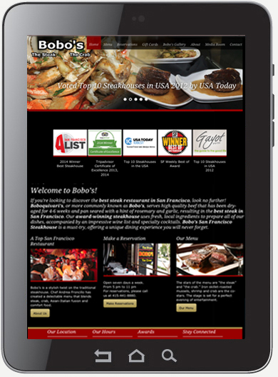
Responsive web design is a website design that adjusts to fit on desktop, laptop, tablet, and smartphone devices. If you have ever pulled up a website on your smartphone and it was a very tiny version of what you would see on your desktop, and you had to zoom in to see the content, then the site was not mobile responsive. A responsive website automatically adapts its layout to fit the screen of the device it is being displayed on. There are 4 common screen sizes that responsive design is aimed at. They are widescreen desktop monitor, laptop, tablet, and mobile phone. As a screen gets smaller, the content and layout of a website modifies so the user can have the best experience possible. Click Here to see examples of mobile responsive sites.
Why is this important?
People are constantly on the move. The majority of our media consumption is screen based. Depending on where people are is a major contributor to what device they are using. When people are on-the-go, they use mobile devices such as a tablet or smartphone to search the internet. In a home or office environment, a laptop or large screen desktop monitor is typically used.
If you own a restaurant and someone is viewing your site on a mobile phone, chances are they want to quickly find your phone number, hours of operation and directions to your restaurant. If someone was viewing your restaurants website on a desktop monitor, they may have more time to browse your sites content. The site should capture their attention with appealing photos of your food and inside the restaurant, food and wine menus, and latest news or events. It is important for you to determine the different needs of your customers before building a responsive design.
According to a Google survey, 48% of users said that if a site didn’t work well on their smartphone, it made them feel like the company didn’t care about their business. Mobile Responsive is definitely the way to go these days.
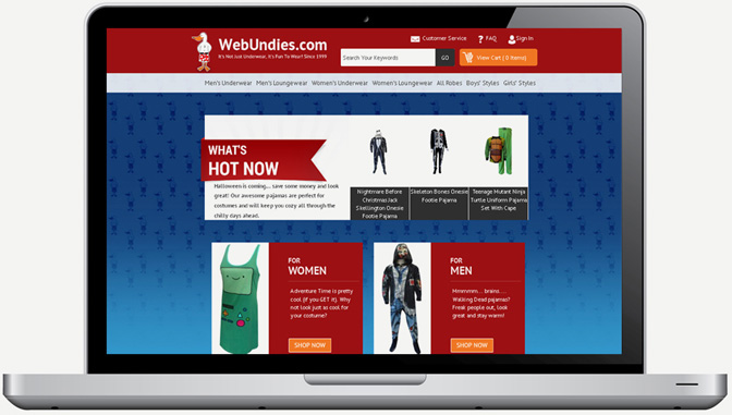
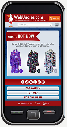
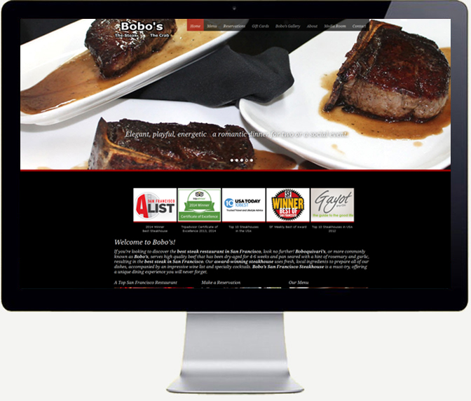
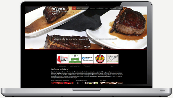
Mobile devices are rapidly overtaking desktops and laptops for Internet browsing, socializing, and most importantly shopping. Does your business rely heavily on your website and online sales? It is time to make your site responsive so you don’t lose sales or market share. If your site has been updated in recent years, Digital Design Solutions can make your site responsive relatively easy. If your site has not been updated in several years, chances are you will need to go thru a complete redesign process which will not only make it responsive but will make your site more SEO friendly. See the difference between a site that is responsive and one that is not below.


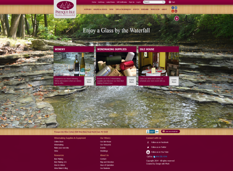
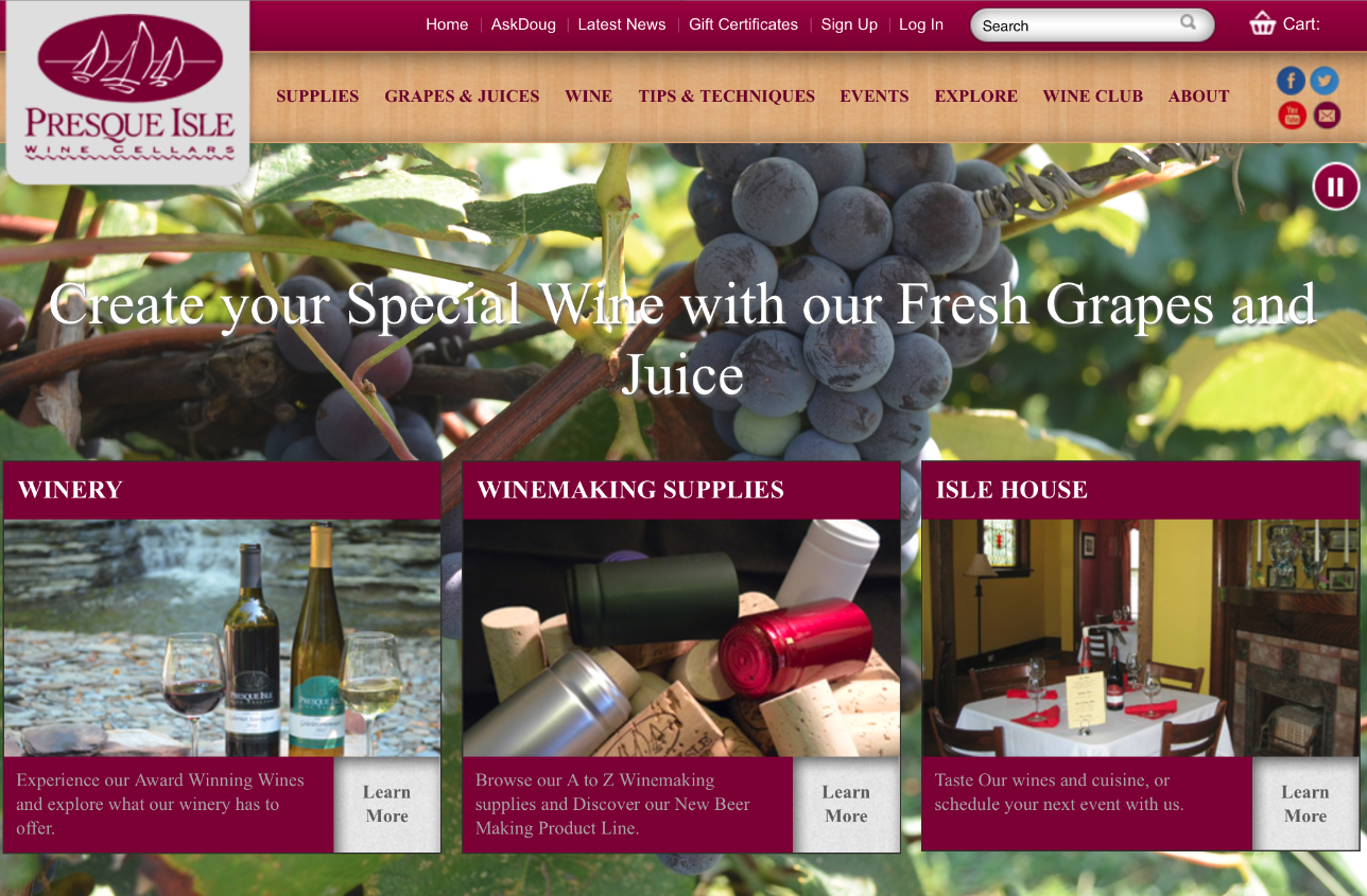
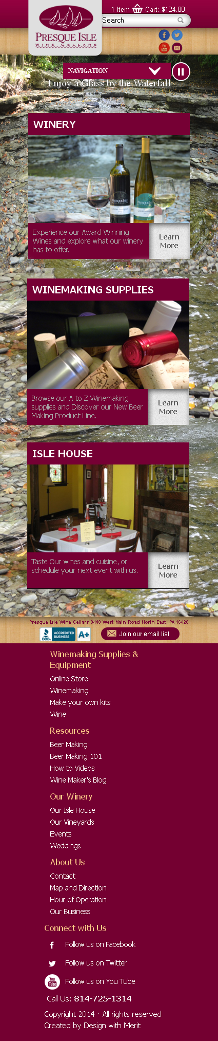
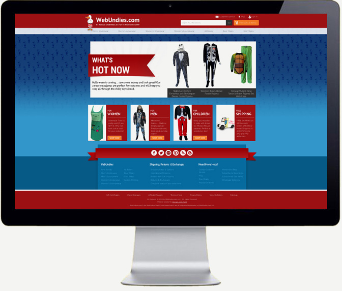
Examples of Responsive Sites:


